GenePedia
Seattle Asian American Film Festival
Sponsorship Deck & Sponsorship Page Redesign
ROLE
Project Manager & UX Strategist - Aaron Yeung
TEAM
Robyn – UX Designer
Yatong – UX Designer
Joann – UX Designer
STAKEHOLDERS
William – Technical Director
Victoria – Festival Director
Adrian – Programming Director
Kyra – Art Director
Lina – Operations Director
TIMELINE
November 2025 - February 2026
TOOLS
Figma, Squarespace, Trello, Google Workspace, Google Analytics
OVERVIEW
I led the redesign of the Seattle Asian American Film Festival’s sponsorship deck and launched a new sponsorship landing page to support corporate outreach for the upcoming festival cycle. The previous sponsorship kit had not been updated since 2023, and there had been no interim version due to limited organizational capacity. As the festival’s reach, audience metrics, and press visibility had grown significantly, the sponsorship materials no longer reflected the organization’s scale or strategic value. The goal of this project was to reposition SAAFF from a grassroots arts nonprofit into a compelling investment opportunity for corporate partners, supported by research, structured data, and a stronger visual system.
MY ROLE
I served as the Project Manager & UX Strategist for this initiative, overseeing both the strategic direction and execution of the sponsorship deck redesign and the new sponsorship landing page. My responsibilities included conducting competitive analysis, synthesizing research through affinity mapping, restructuring the information architecture, redesigning sponsorship tiers, and developing updated data visualizations. I also designed and built the sponsorship webpage to function as a conversion-focused extension of the deck.
Beyond design, I managed the project workflow using an agile approach, organizing sprint phases and tracking tasks in Trello. I facilitated stakeholder communication across festival leadership, aligned on pricing and positioning decisions, and translated research insights into clear messaging and visual strategy. This role required a combination of UX thinking, business strategy, and cross-functional coordination to ensure the final deliverables were both visually cohesive and strategically positioned for sponsor engagement.
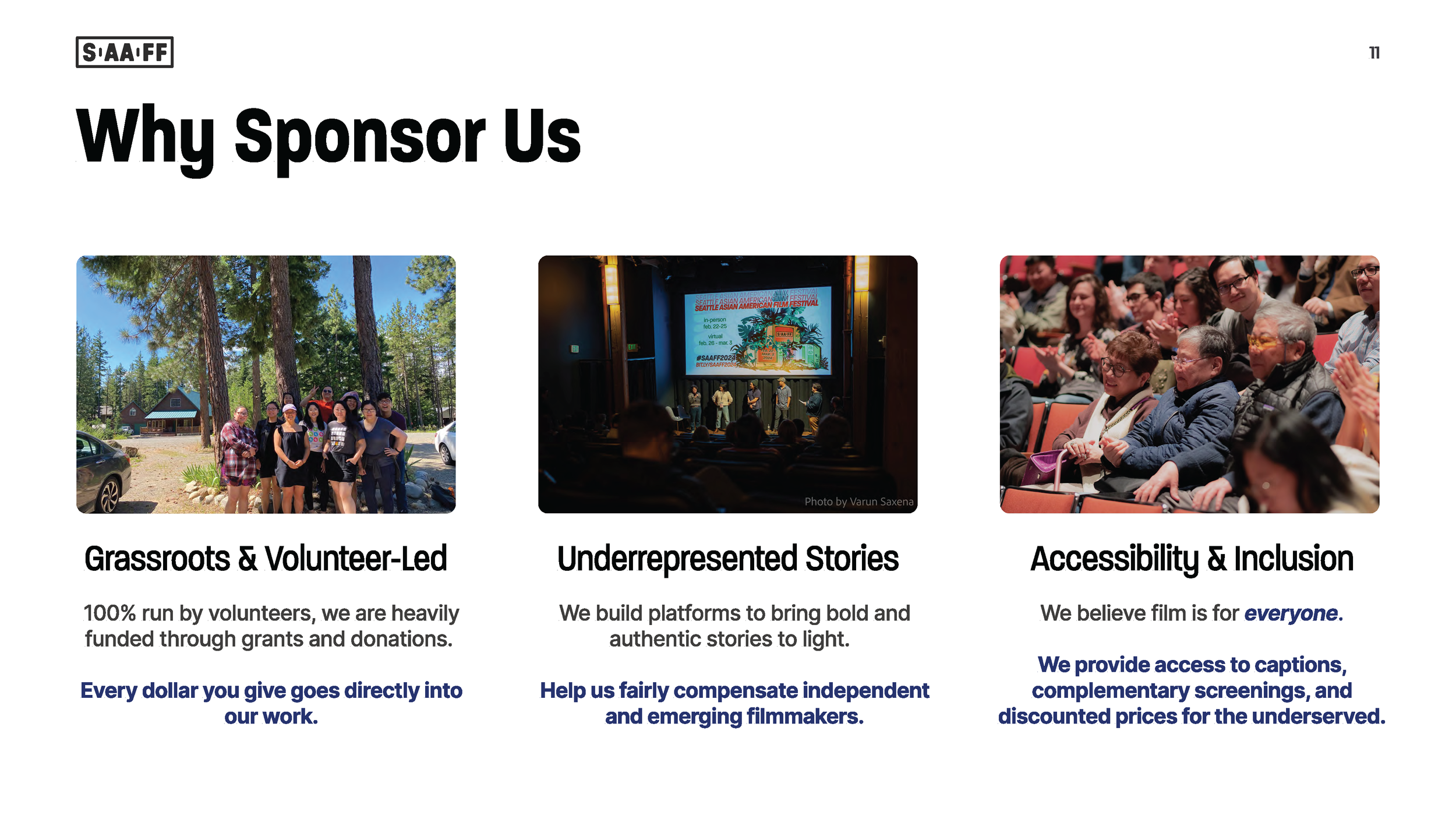
The Problem
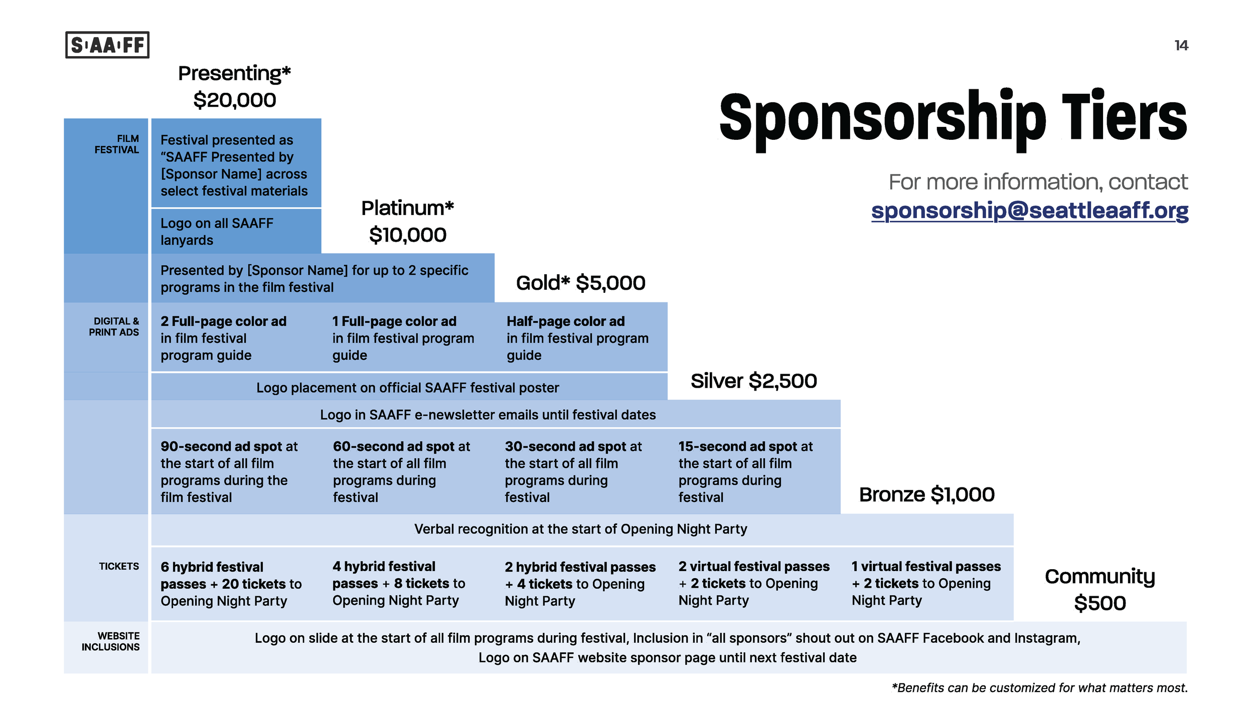
The 2023 sponsorship kit was informative but largely static and text-heavy. It emphasized mission and community impact but lacked a clear market positioning strategy. Sponsorship tiers were presented in dense tables, demographic information was not fully contextualized, and there was no integrated web experience to support conversion. As a result, the materials felt transactional rather than strategic and did not clearly communicate return on investment for potential sponsors.
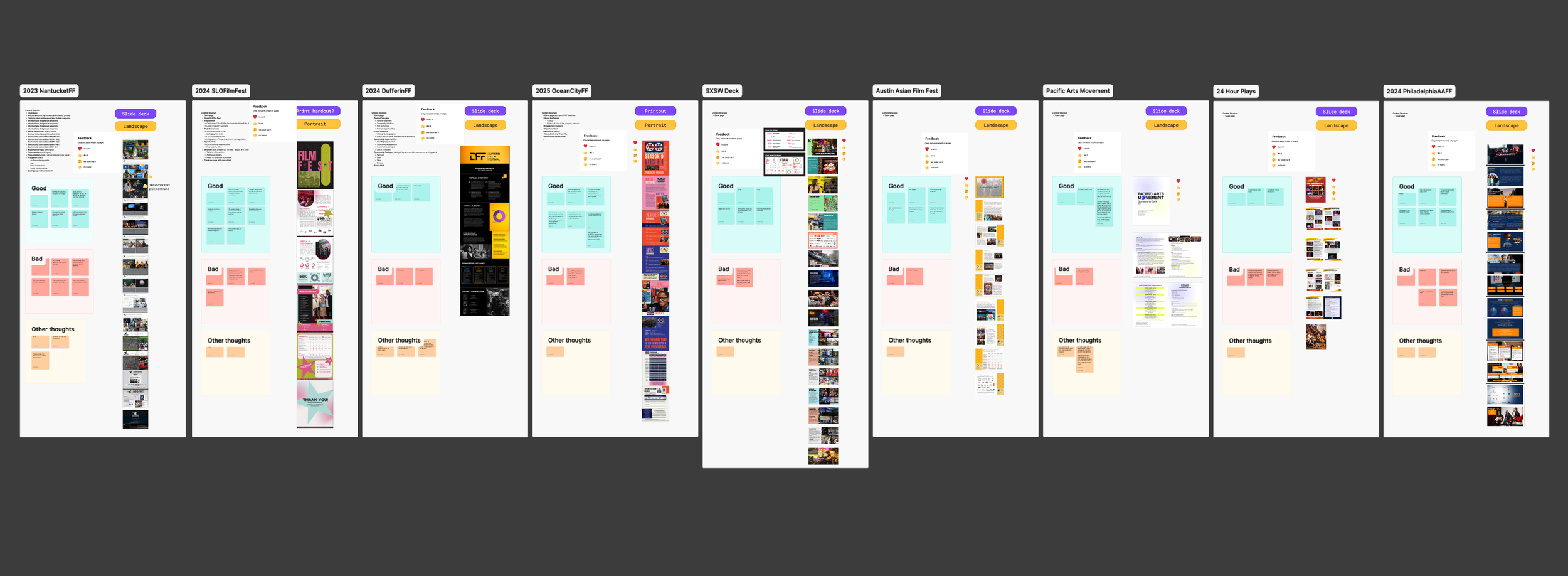
Research: Competitive Analysis & Affinity Mapping
To inform the redesign, I conducted a competitive analysis of ten regional and national film festival sponsorship decks. I evaluated tier structures, pricing anchoring strategies, demographic framing, visual hierarchy, and how other organizations communicated sponsor visibility and ROI.
From this research, I facilitated an affinity mapping exercise to synthesize patterns and insights. Key themes emerged around market growth storytelling, premium tier anchoring, social proof, and clarity of benefits. One consistent finding was that stronger decks led with audience reach and buying power rather than mission alone. This insight directly influenced the restructuring of both the deck and the website, ensuring that market size, engagement metrics, and demographic data were positioned prominently at the start of the narrative.
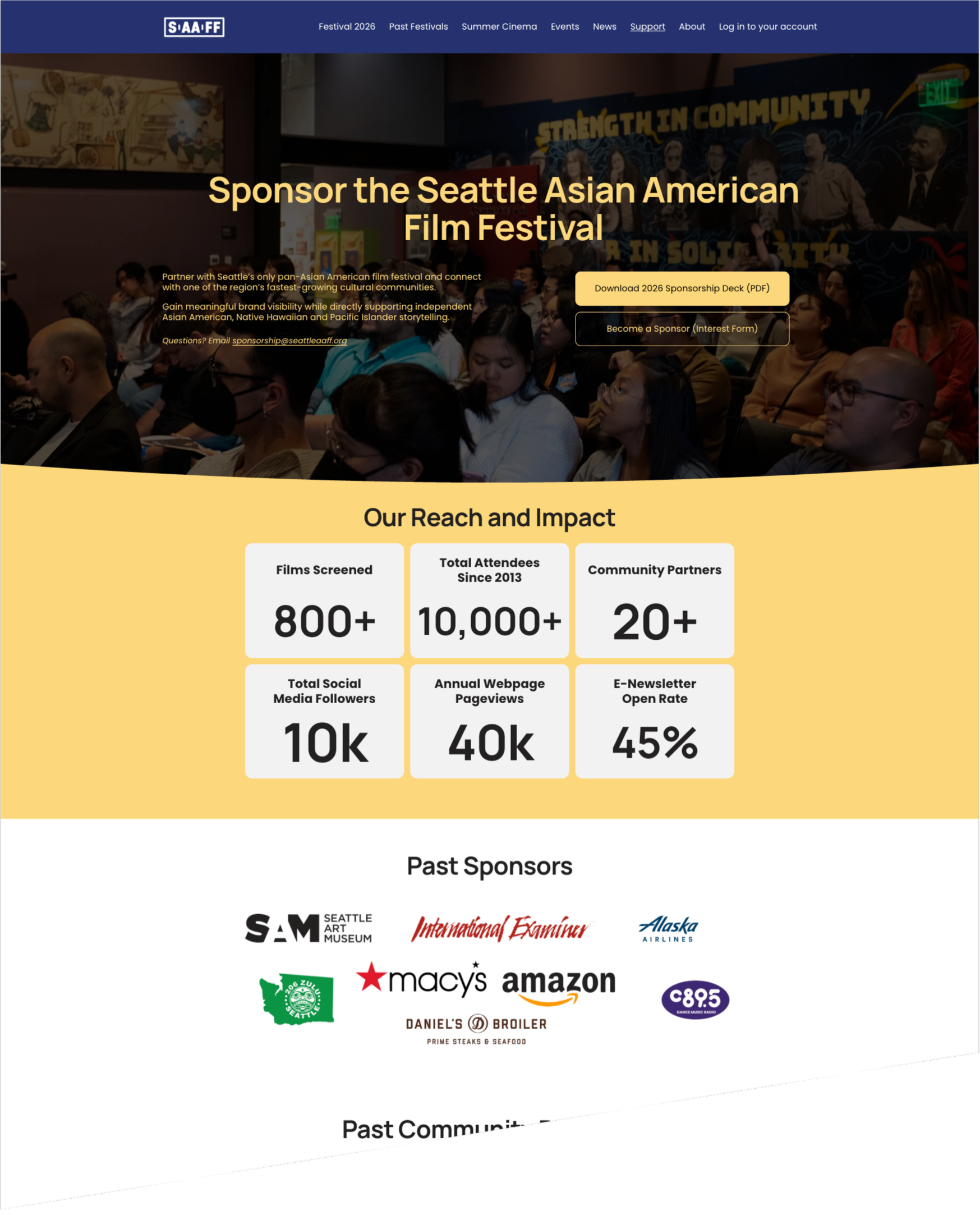
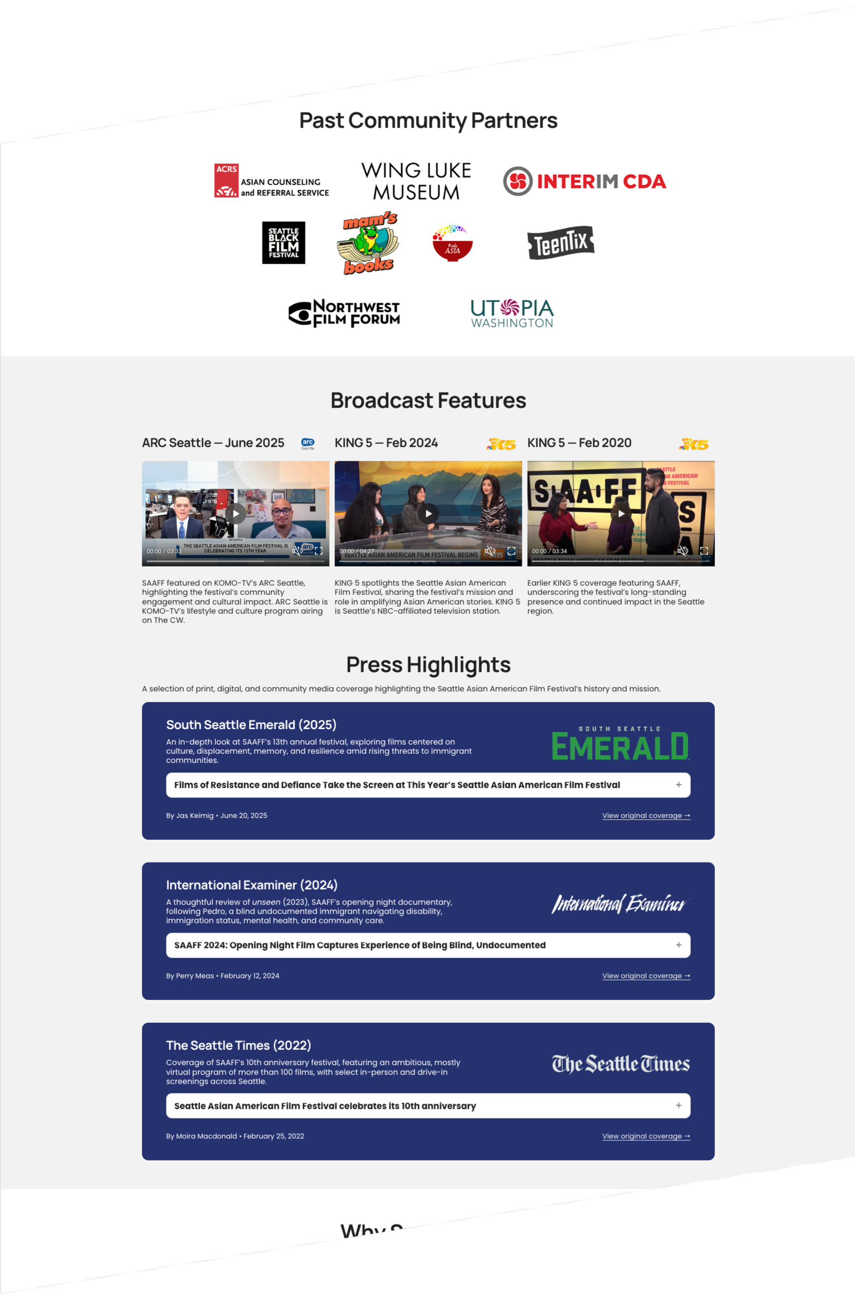
Sponsorship Website Page
In addition to redesigning the deck, I created a dedicated sponsorship landing page to function as a digital extension of the pitch. Instead of simply hosting a downloadable PDF, the page presents a structured persuasion flow: reach and impact metrics, sponsor logos for credibility, broadcast and press highlights, community positioning, tier visualization, and finally a clear call to action.
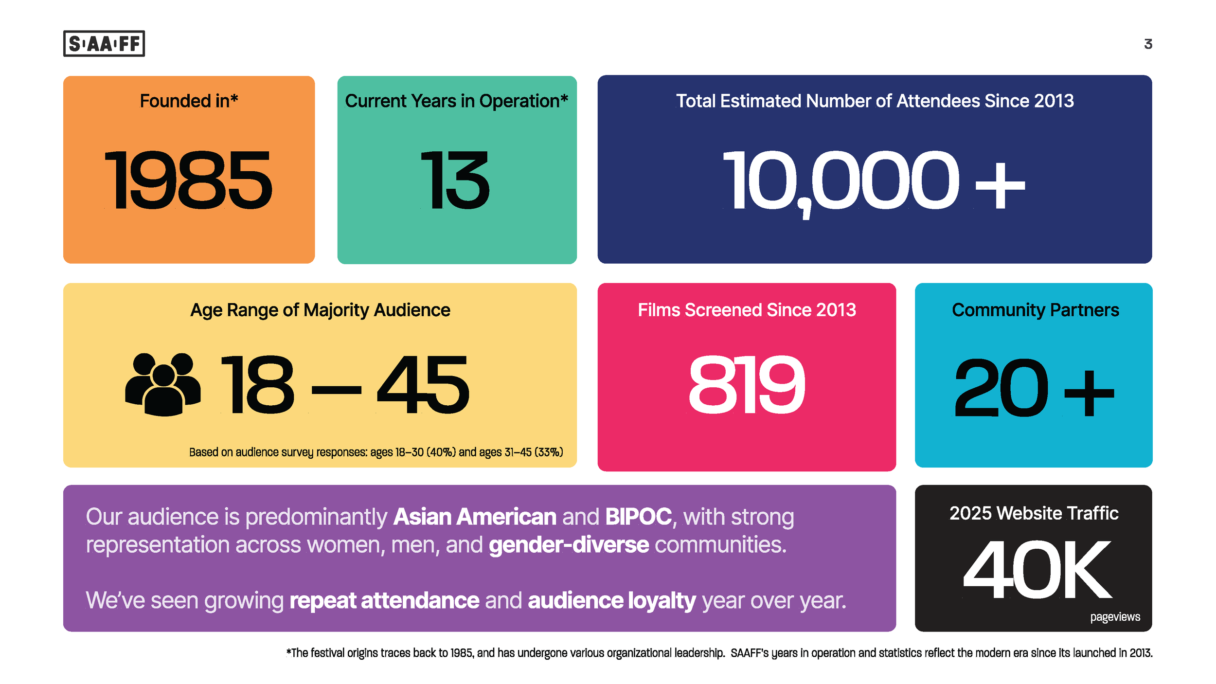
The hero section establishes scale immediately, while scannable impact cards (e.g., films screened, total attendees, social reach, website pageviews, email open rate) provide quick, digestible validation of audience engagement. The page ends with dual CTAs to download the sponsorship deck or complete an interest form, creating a clearer conversion funnel than previously existed.
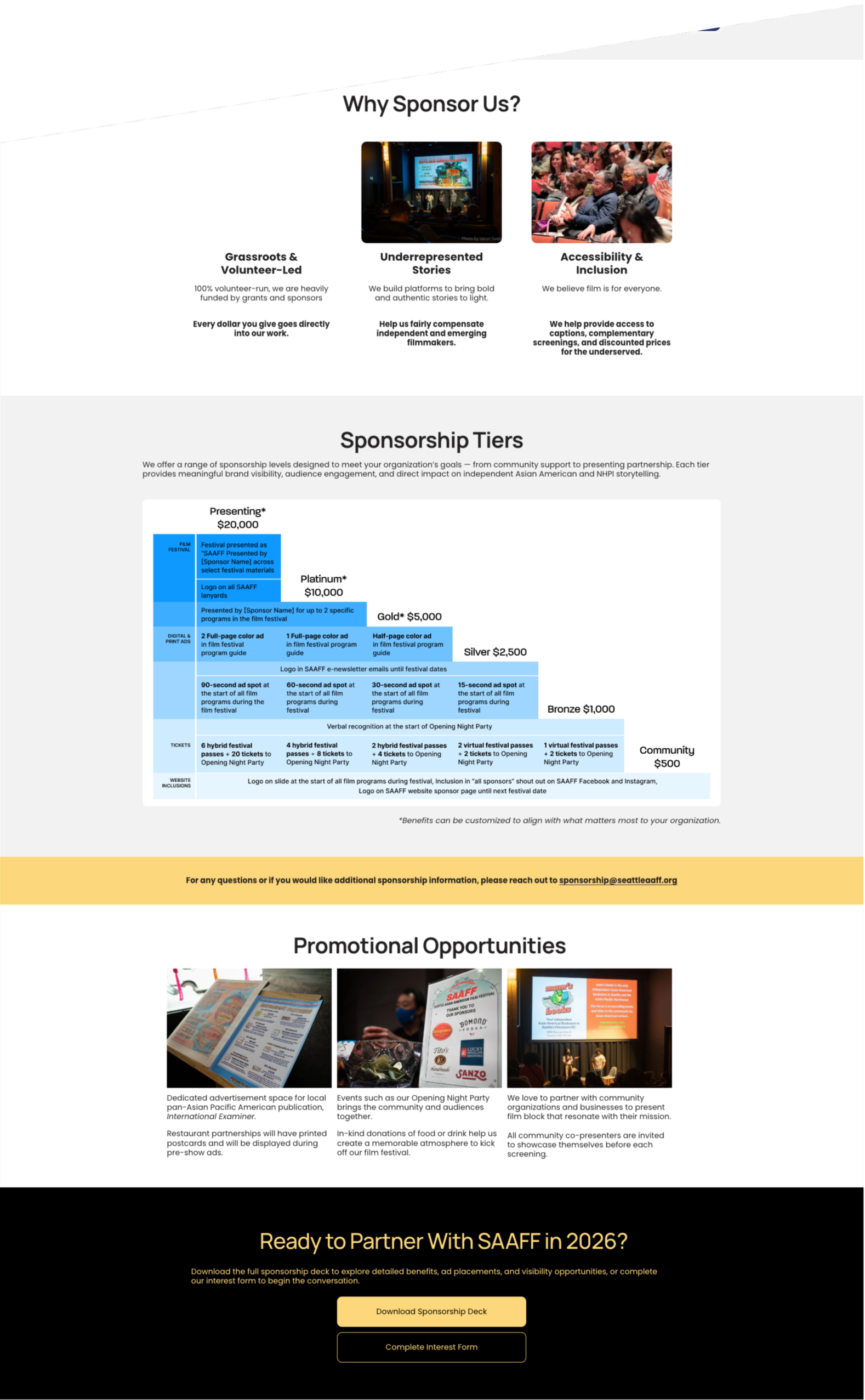
Data Visualization & Impact Design
A major focus of the redesign was improving how data was visualized and contextualized.
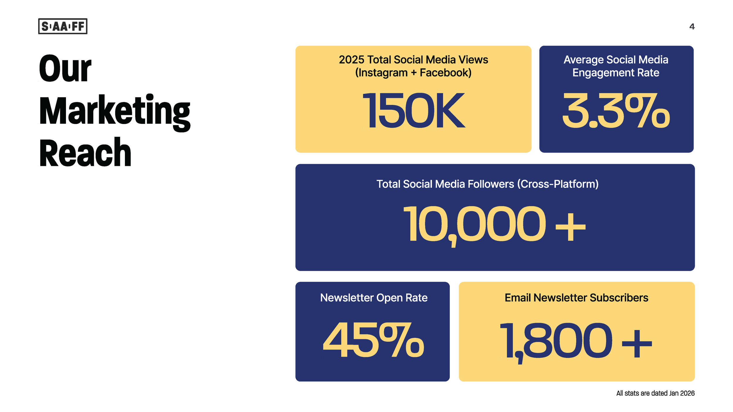
On the website, I introduced structured impact cards to highlight key performance metrics such as total attendees, films screened, annual pageviews, social media followers, and email engagement rate. These cards were intentionally designed to reduce cognitive load and allow potential sponsors to quickly grasp scale and audience loyalty.
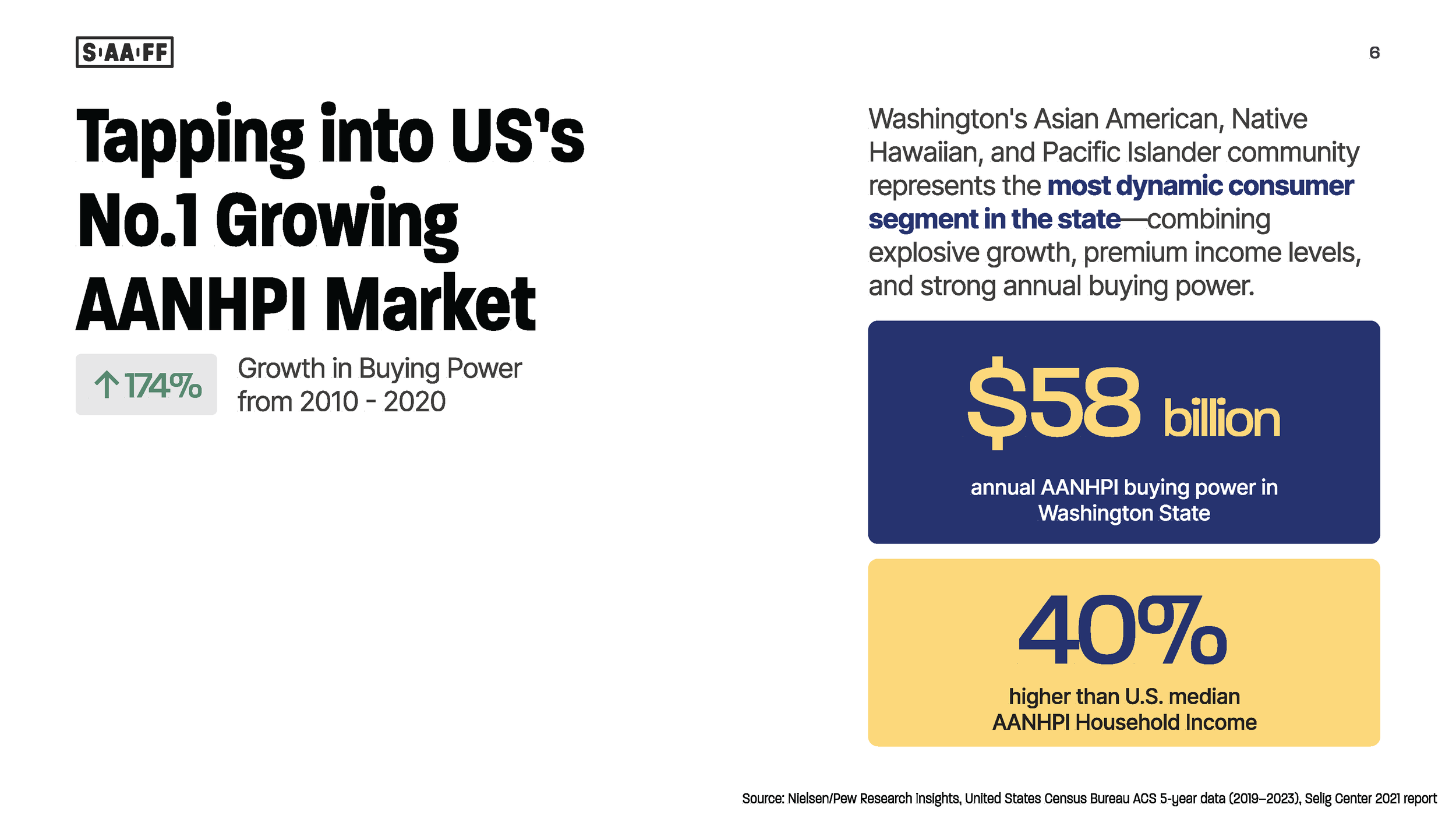
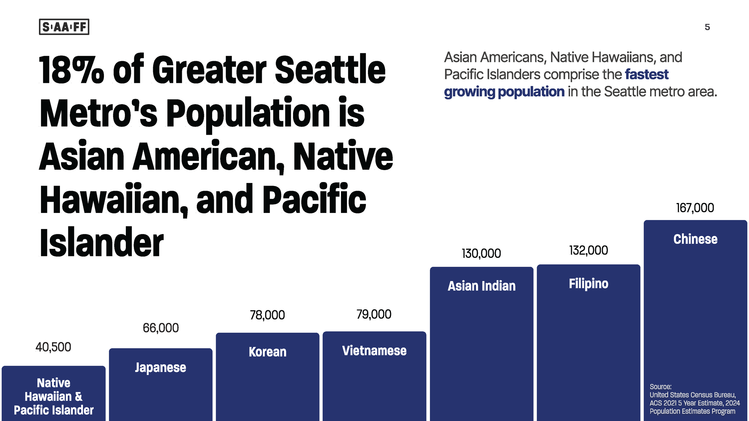
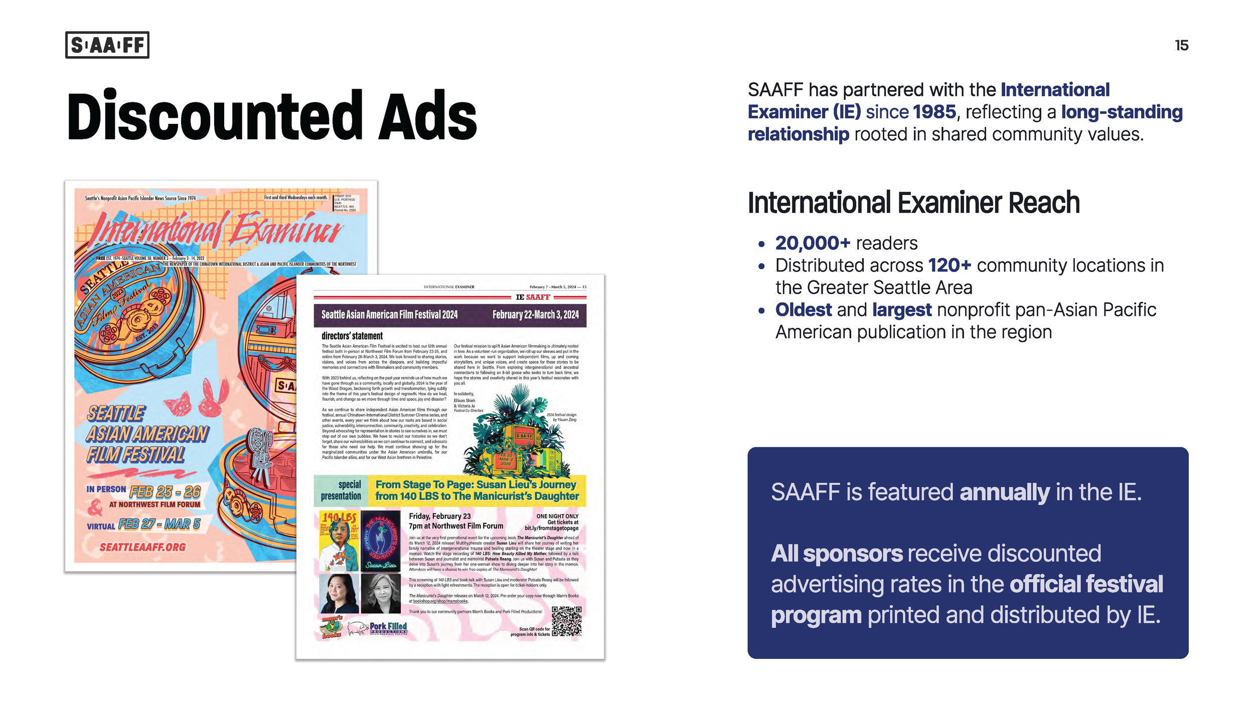
Within the deck, I refined demographic data visualization using updated census-based charts and buying power statistics. Instead of presenting raw data alone, the visualizations frame Asian American, Native Hawaiian, and Pacific Islander populations as one of the fastest-growing consumer segments in the region. This shift repositioned the data from informational to strategic — connecting audience demographics directly to sponsorship value.

Project Management & Stakeholder Leadership
This project was managed using an agile workflow with defined sprint phases for research, restructuring, visual updates, and stakeholder review. I organized tasks and timelines through Trello and facilitated ongoing communication across festival leadership.
Because SAAFF is a fully volunteer-run organization, alignment required thoughtful stakeholder management. I worked closely with leadership to refine tier pricing, validate demographic data, and secure buy-in on repositioning language that shifted the narrative from “support our nonprofit” to “partner with a high-growth cultural market.” Iterative feedback cycles ensured both strategic and brand alignment before final publication.
Outcome
A Connected Sponsorship Ecosystem
The final deliverables included a fully redesigned 2026 Sponsorship Deck and a new dedicated Sponsorship Landing Page, creating a cohesive, multi-surface sponsorship experience.
The deck is no longer a static PDF. It now functions as an interactive document with embedded navigation to press coverage, broadcast features, video segments, and related articles. Sponsors can move seamlessly from the pitch to real-world validation with a single click when viewing digitally.
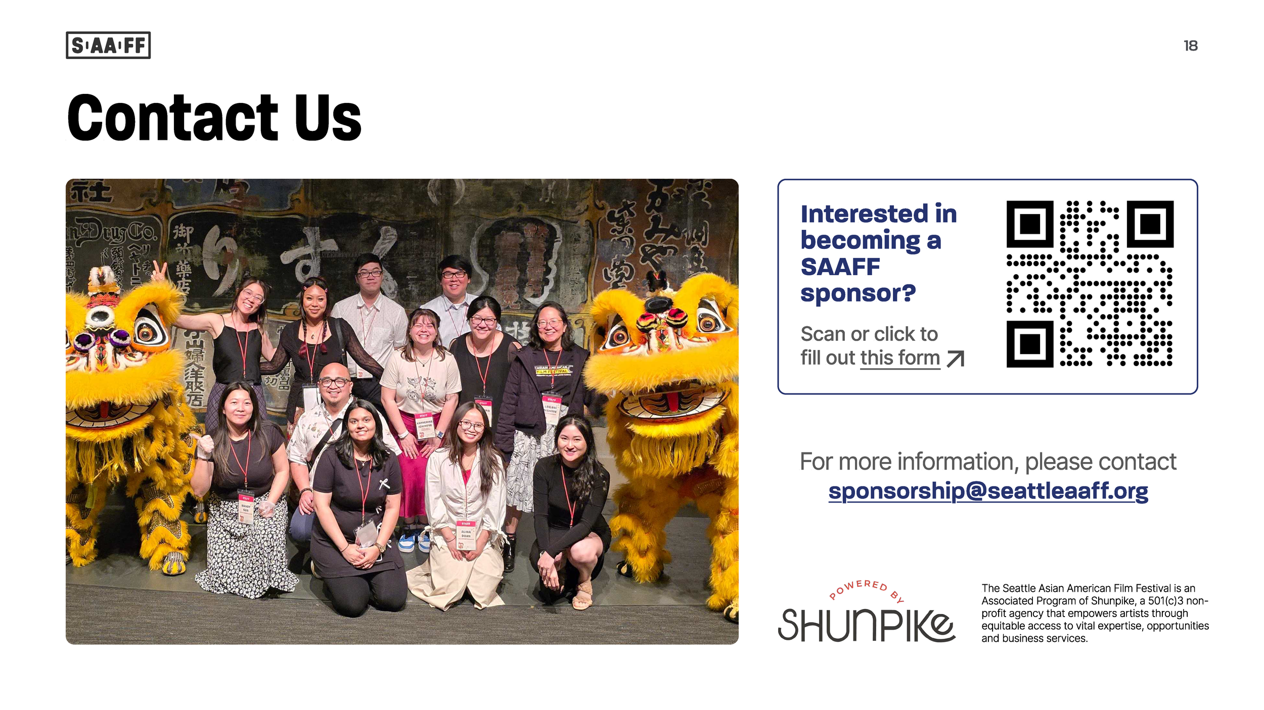
To strengthen conversion, we introduced a Sponsorship Interest Form that is directly linked within the deck and the website. A QR code was also embedded into the document to ensure accessibility when the deck is printed and shared in physical settings. This dual-format access ensures the sponsorship inquiry process works in both digital and in-person contexts.
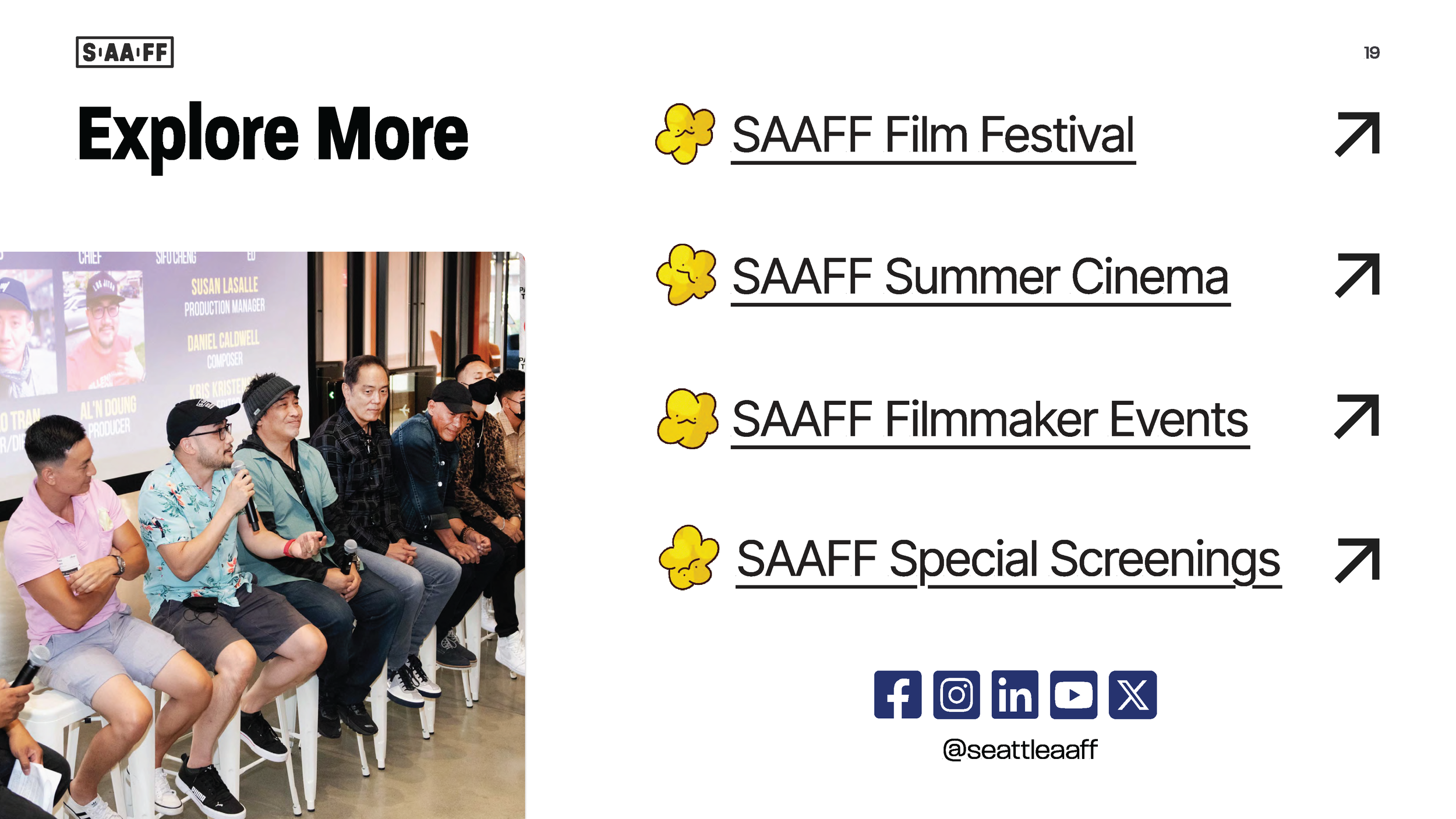
The final page of the deck, “Explore More,” extends the experience further by linking to four additional landing pages — including festival programming, year-round events, and related initiatives — along with all official social media channels. When viewed on a computer, this section allows sponsors to explore the broader SAAFF ecosystem beyond the core sponsorship materials.
Together, these updates transformed the sponsorship materials from a static informational packet into a structured, conversion-focused revenue tool.
Live Sponsorship Page
Explore the live sponsorship experience: www.seattleaaff.org/sponsorship
This landing page mirrors the deck’s strategic narrative while offering a scannable, web-optimized persuasion flow and direct access to the sponsorship interest form.
2026 Sponsorship Deck


Thanks for reading! If you want to collaborate, talk about UX Design, or want to say hello, find me at aaron.l.yeung@gmail.com or connect via LinkedIn.
Other Works